brand: Autodesk
PRoject: Brand Identity concept
Team: Media.Monks
Role: Group creative director
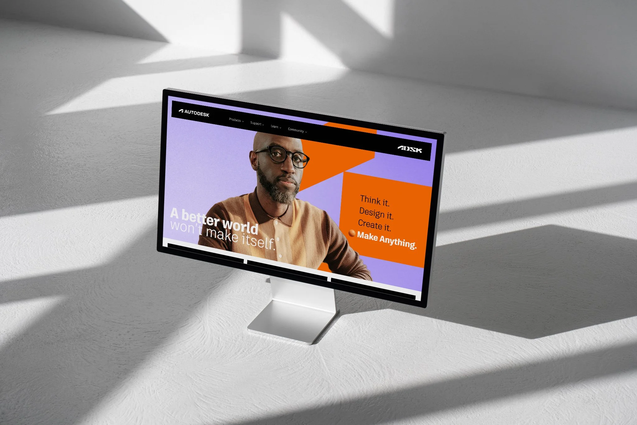
The identity designed to make anything
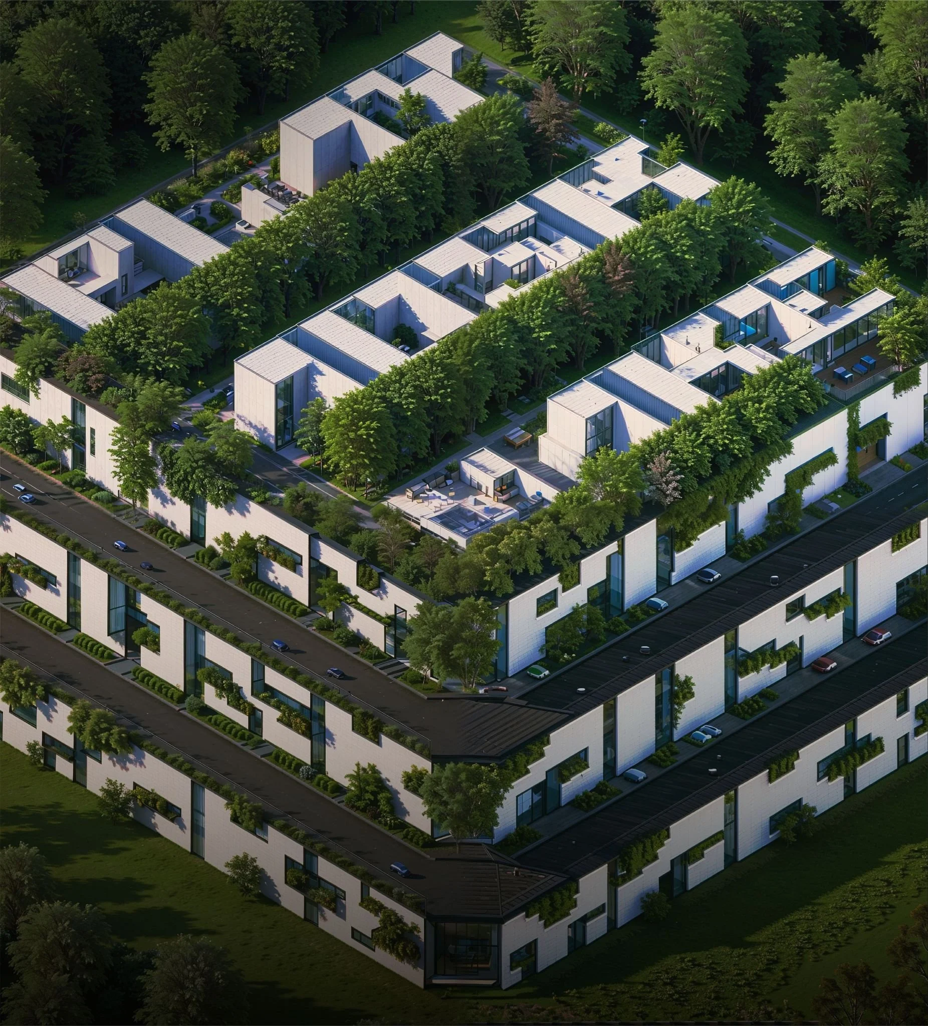
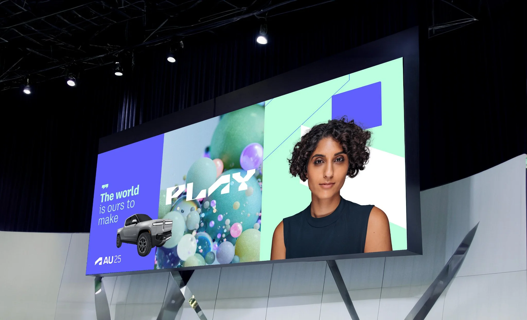
Autodesk had outgrown the perception of being “the AutoCAD company” and needed a brand identity that reflected its broader impact across architecture, engineering, construction, manufacturing, media, education, and entertainment. The opportunity was to build a system as flexible and expressive as the world Autodesk helps design & make — one rooted in human ingenuity rather than software.
Our brand team at Media.Monks partnered with Autodesk to explore a more story-driven, modular identity that could flex across industries, products, and topics. These explorations were delivered as concept work for Autodesk’s internal brand team, who owned implementation across their ecosystem. Some directions were adopted and adapted; others remained conceptual — all contributing to Autodesk’s ongoing evolution.

From logo to language
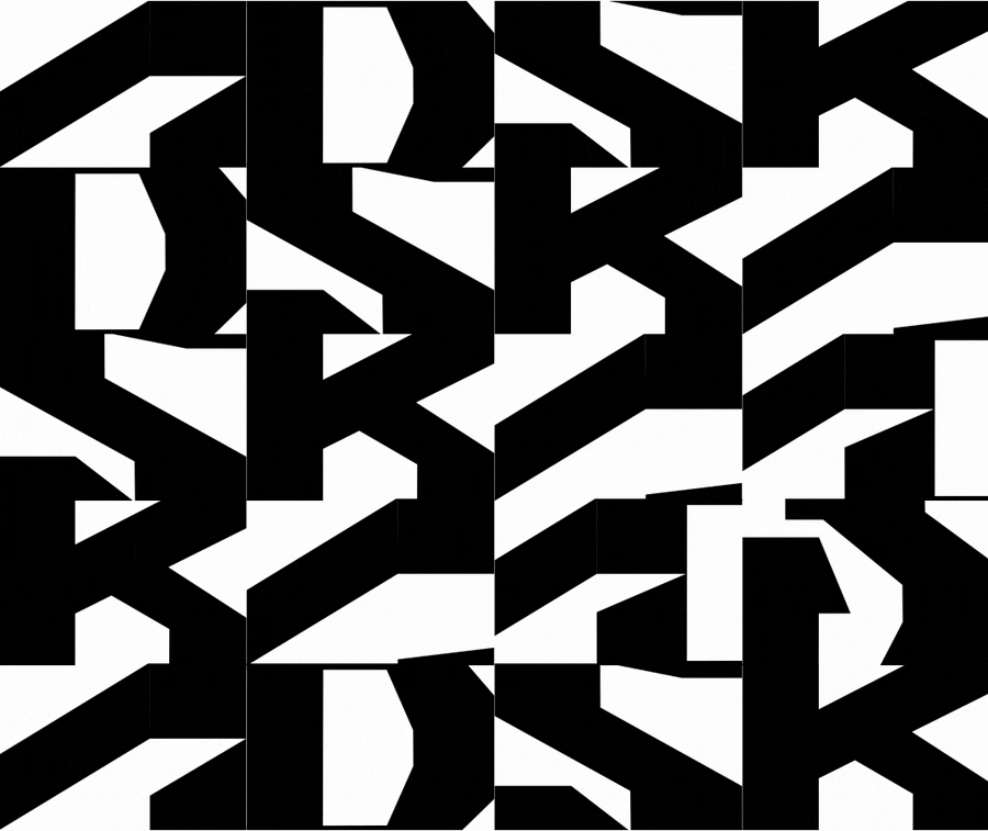
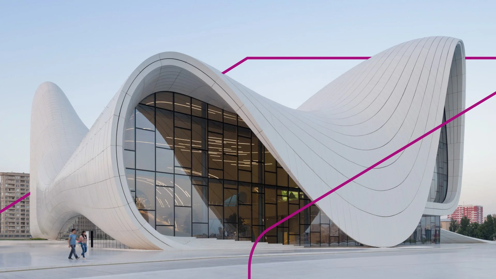
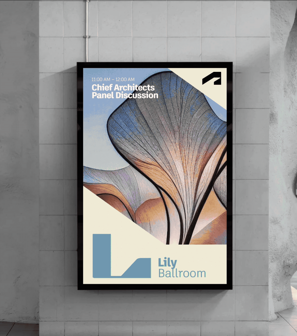
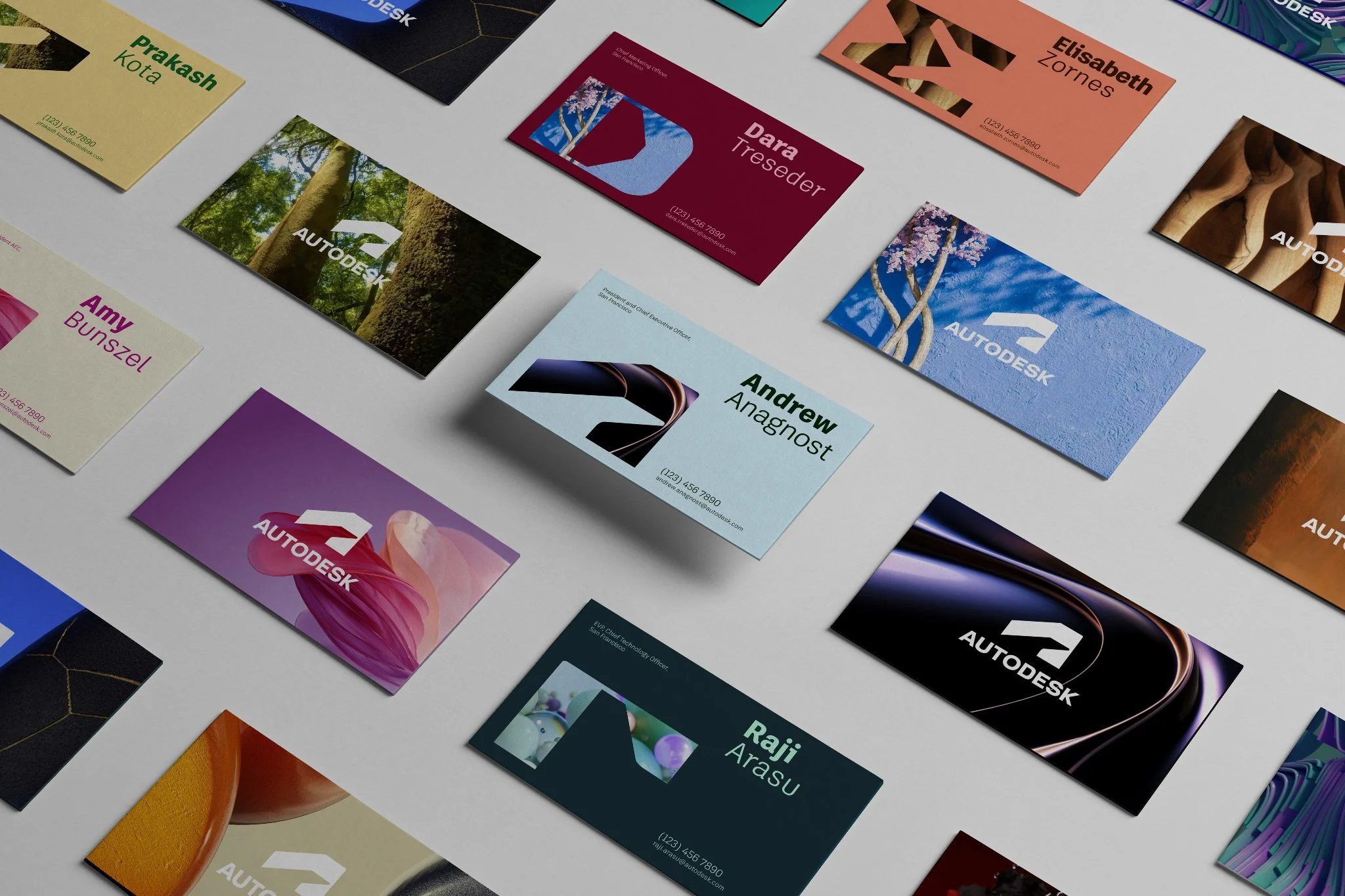
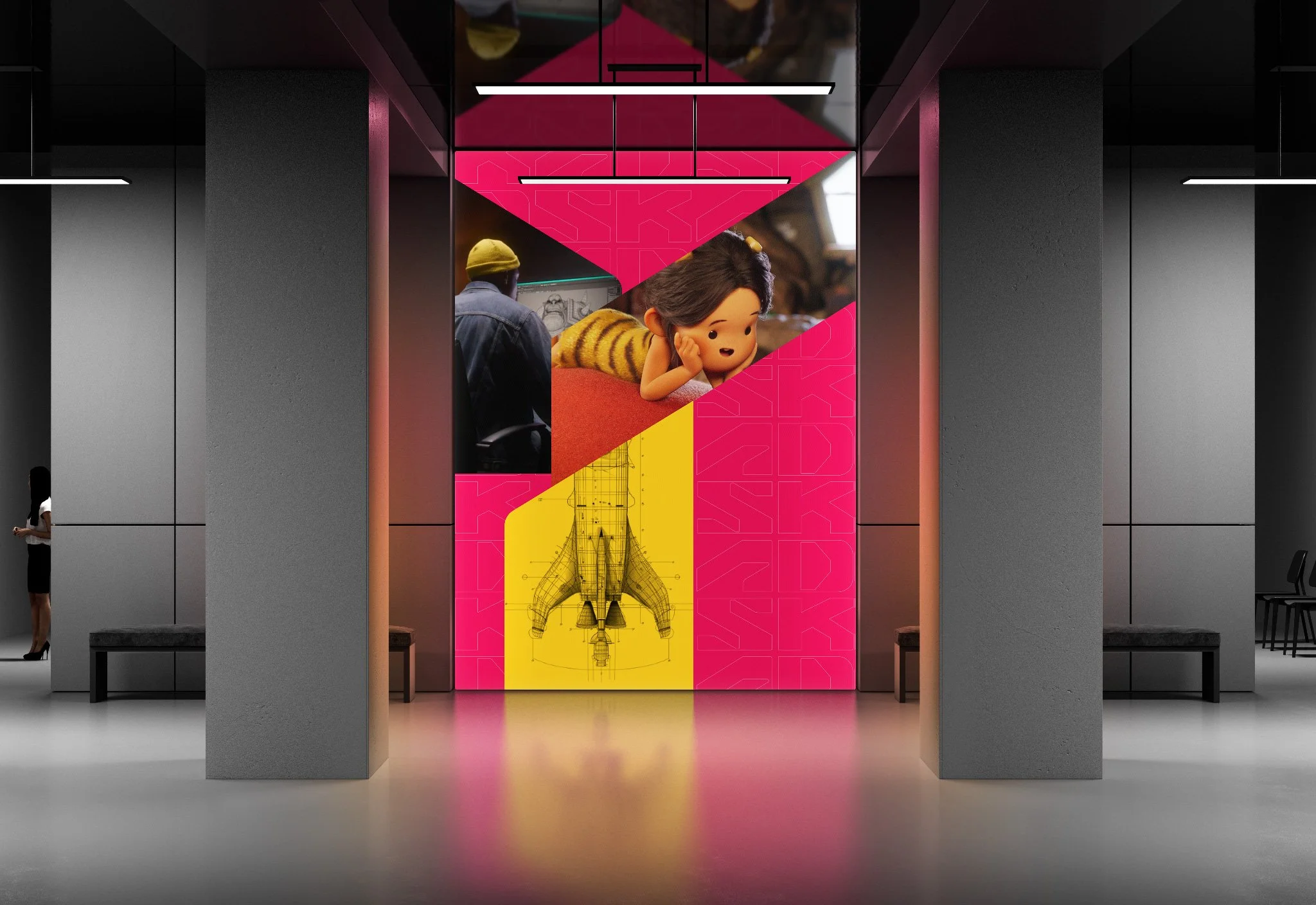
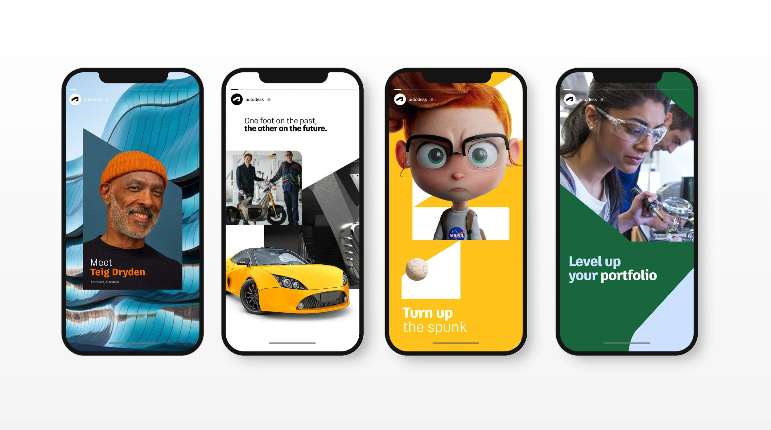
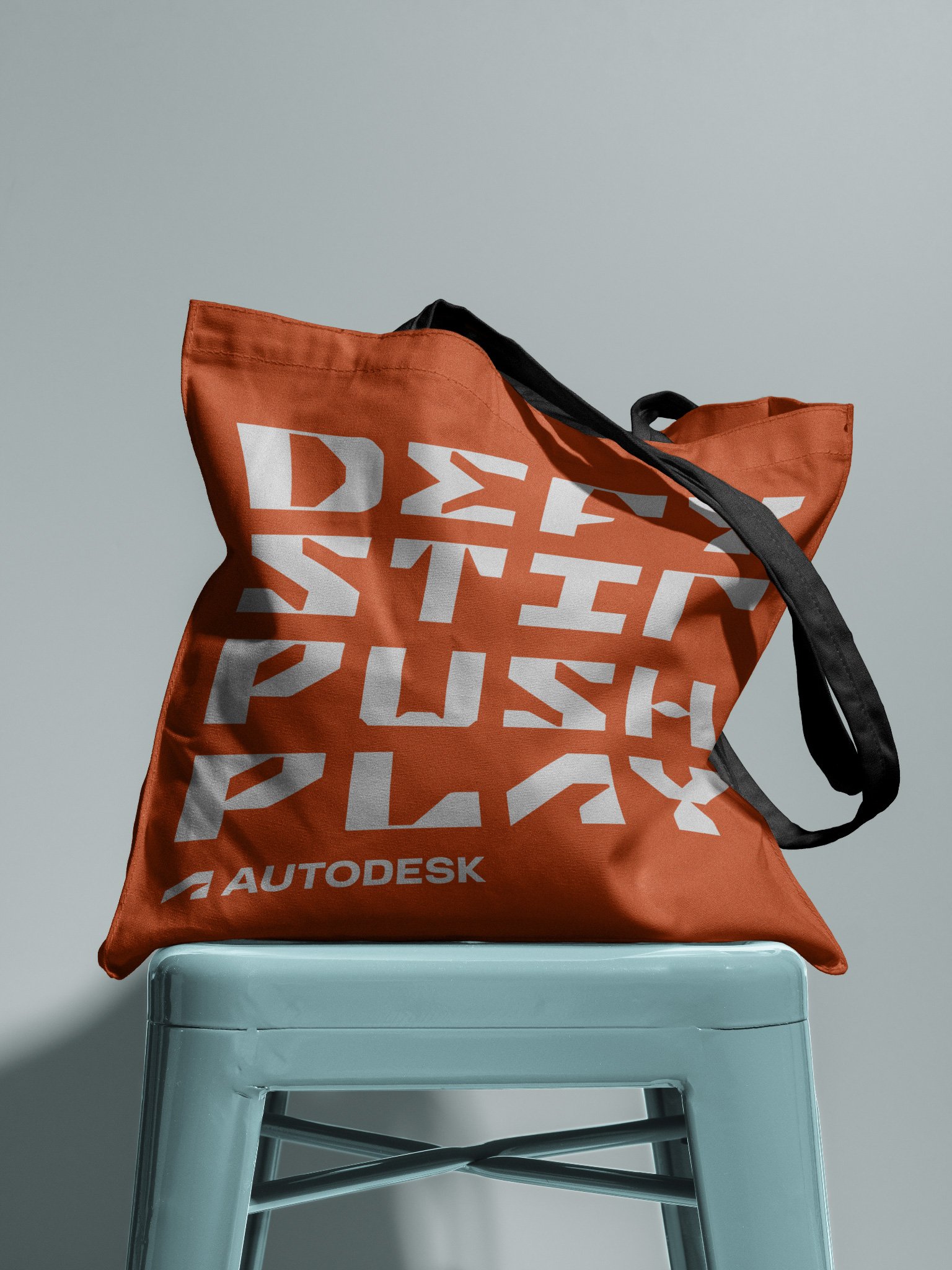
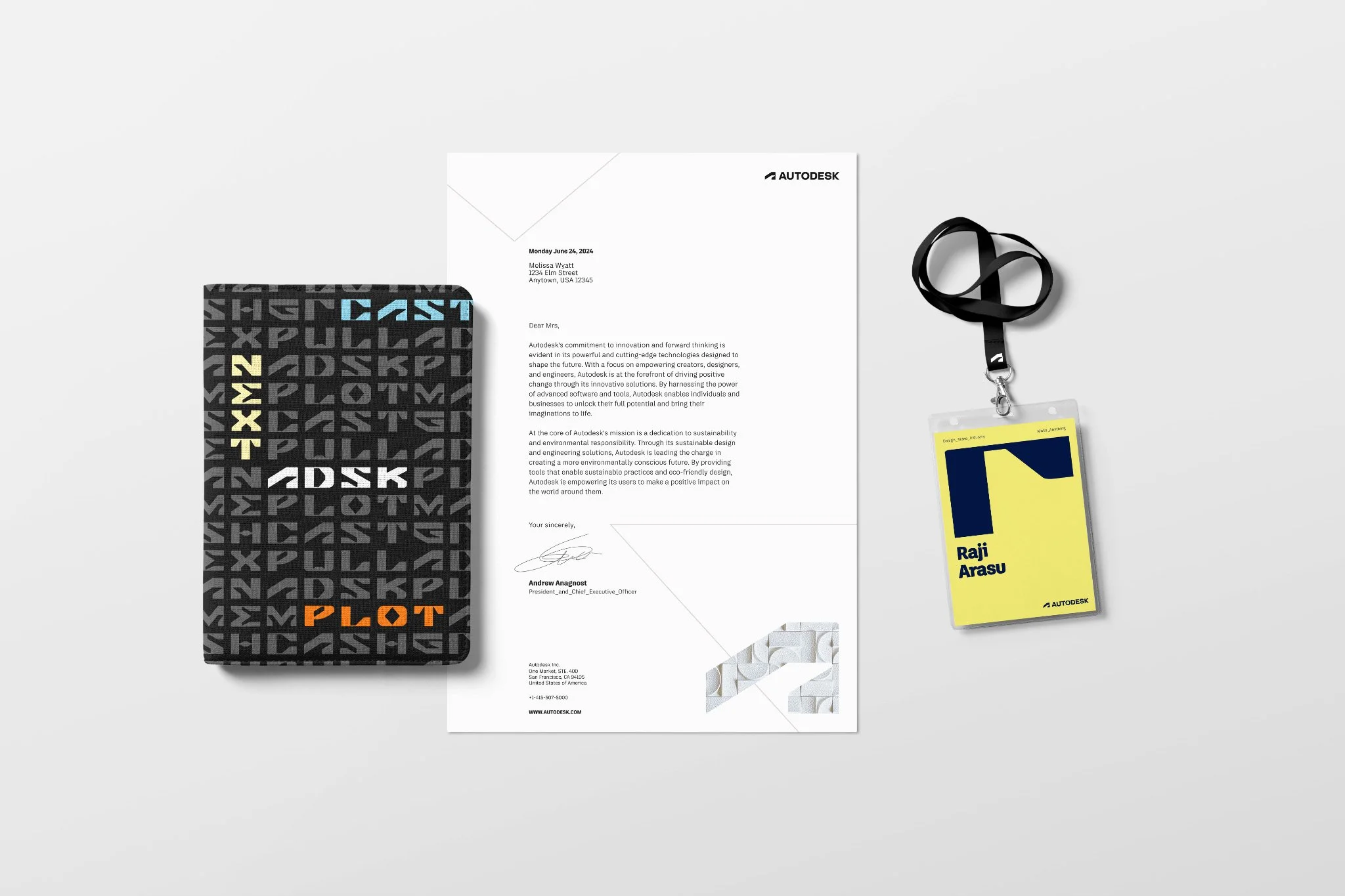
The system begins with the Autodesk logo, deconstructing the ramp, platform, and foot into elemental forms — pieces that can assemble, frame, and build. These shapes become dynamic building blocks that open windows into Autodesk’s world.
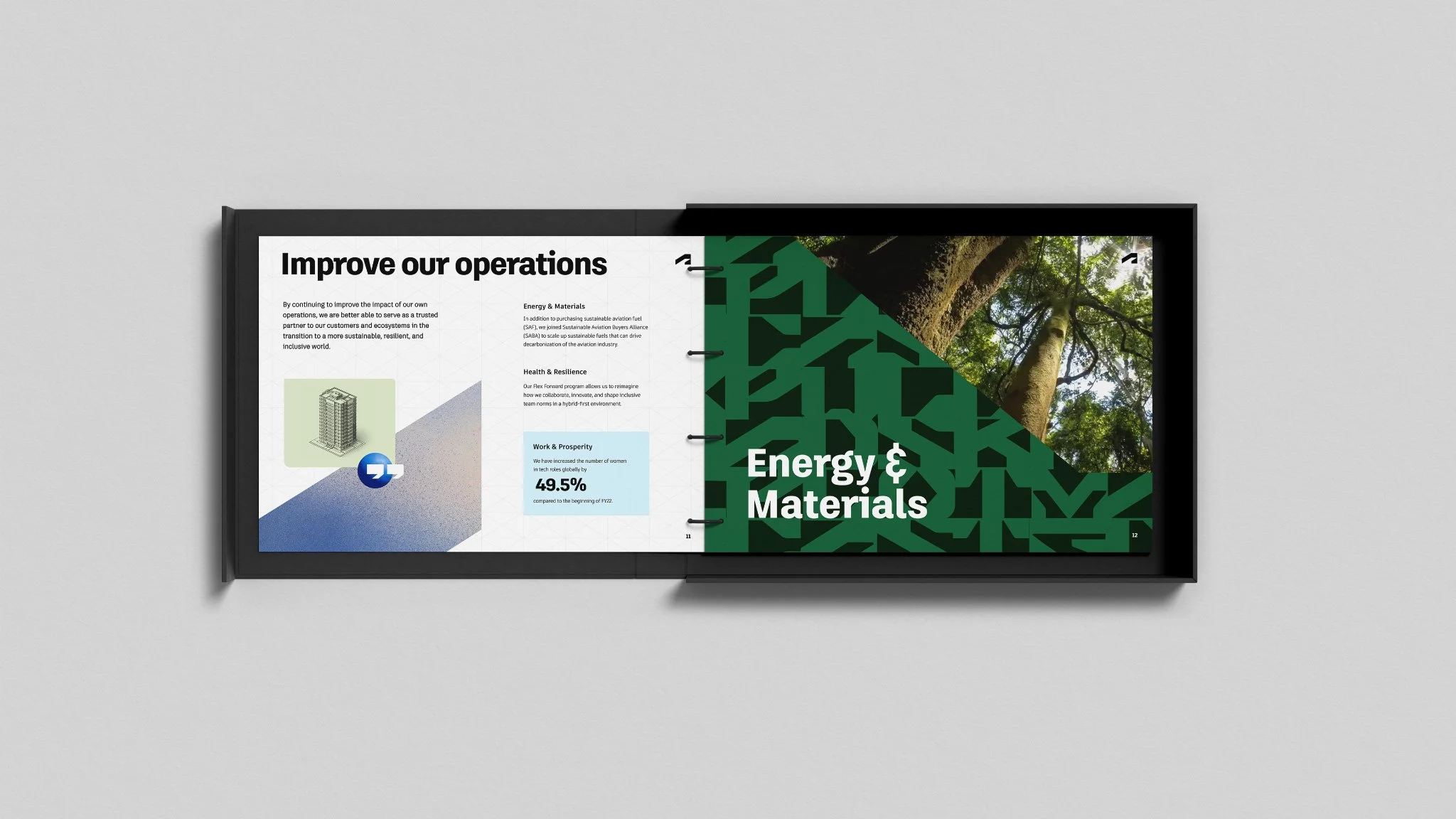
From there, the elements evolve into a modular visual language: forming typography, interacting with imagery, mapping across surfaces, and expanding into color, pattern, and texture. A flexible signature system designed, and made, to express anything.