brand: Cummins
PRoject: Brand PLATFORM
Team: Media.Monks
Role: Group creative director
A new identity for a new era of power
For more than a century, Cummins has powered the world’s most essential industries. As the brand looked toward its future, the identity needed to signal evolution, not reinvention. Its reputation for dependability, strength, intelligence, and efficiency hadn’t changed — the brand simply needed to look and sound the way its products perform.
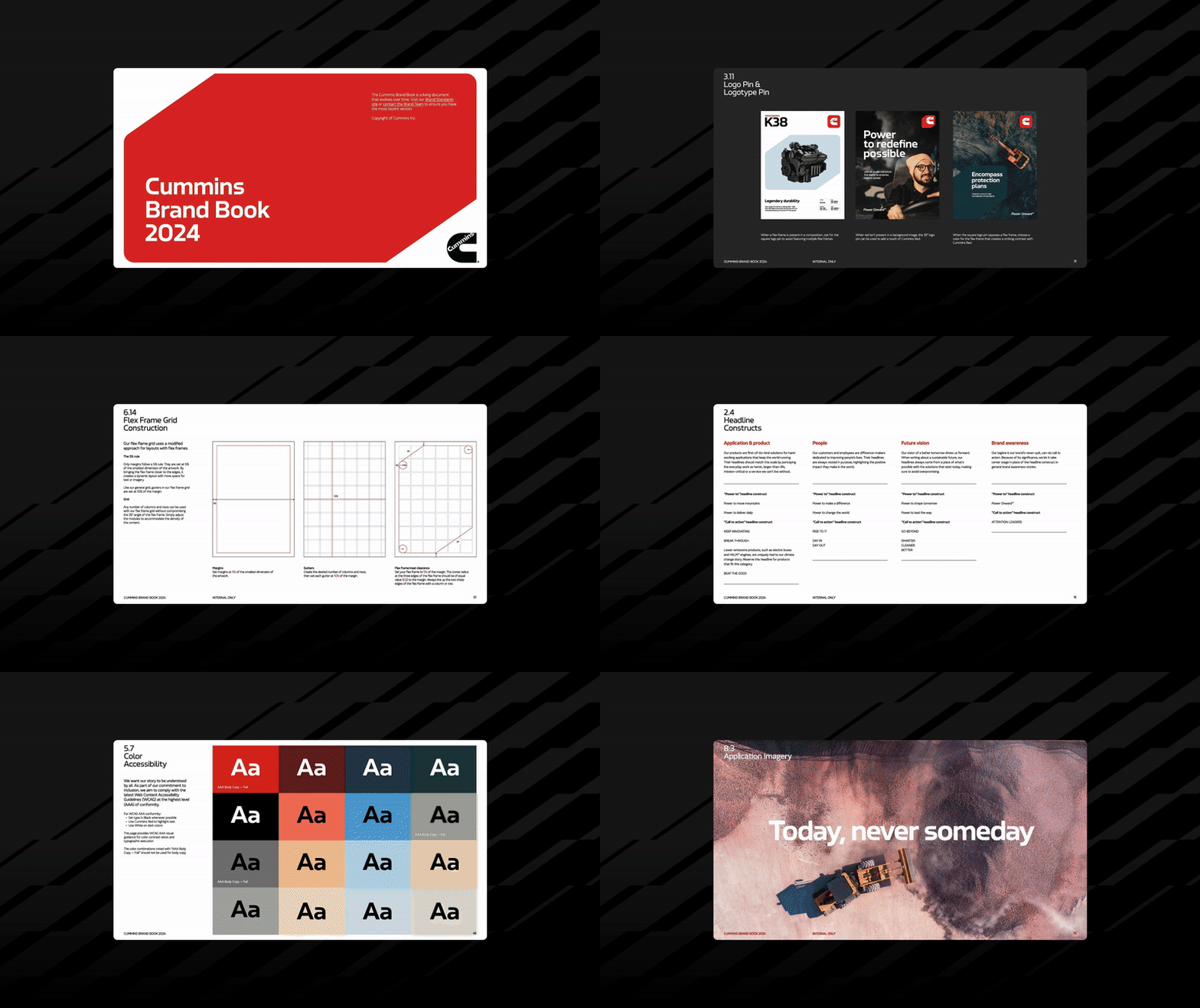
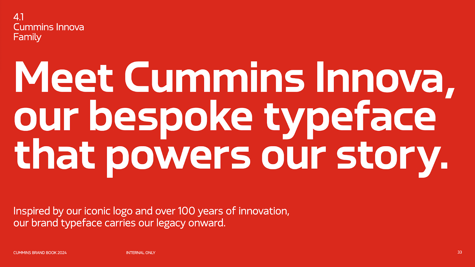
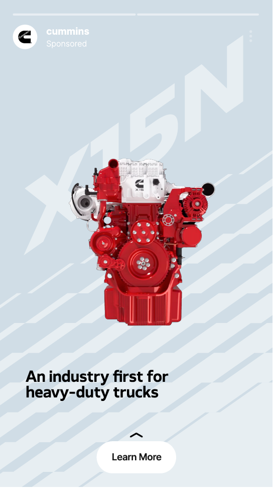
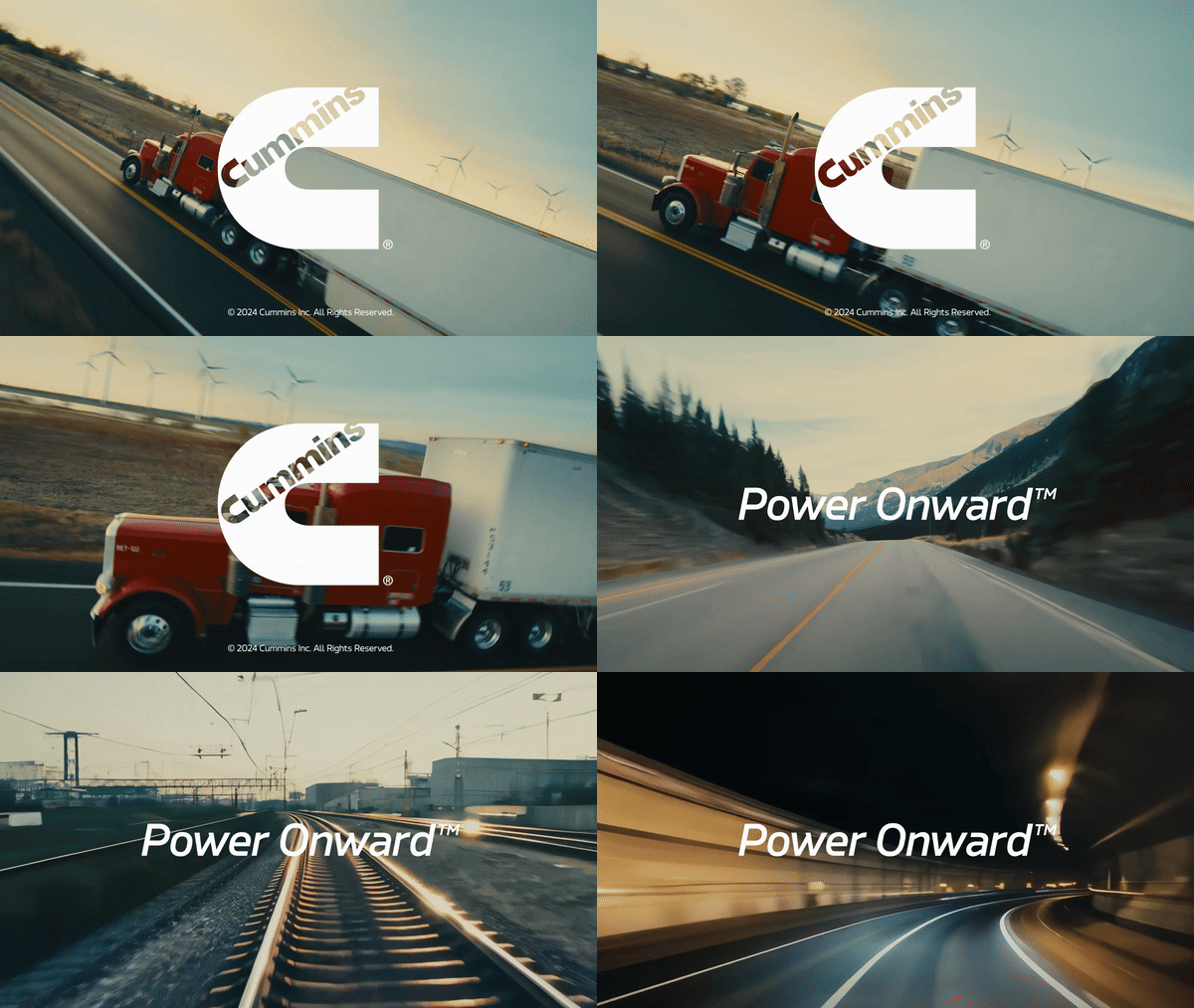
Our team delivered strategic and creative leadership across the full brand ecosystem — redefining the visual identity, introducing the Power Onward™ tagline, creating a custom font family (Cummins Innova), producing a global brand film, and developing more than 40 adaptable templates. This transformation positions Cummins for the next era of smarter, cleaner, and more sustainable power.
A legacy leaning into the future
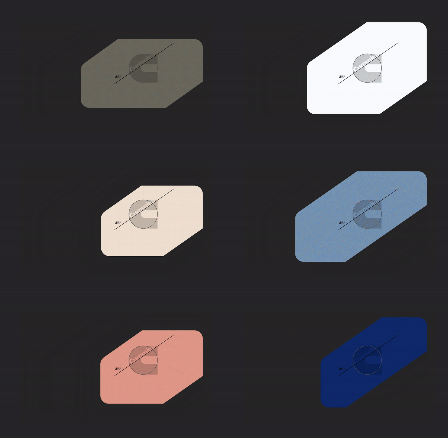
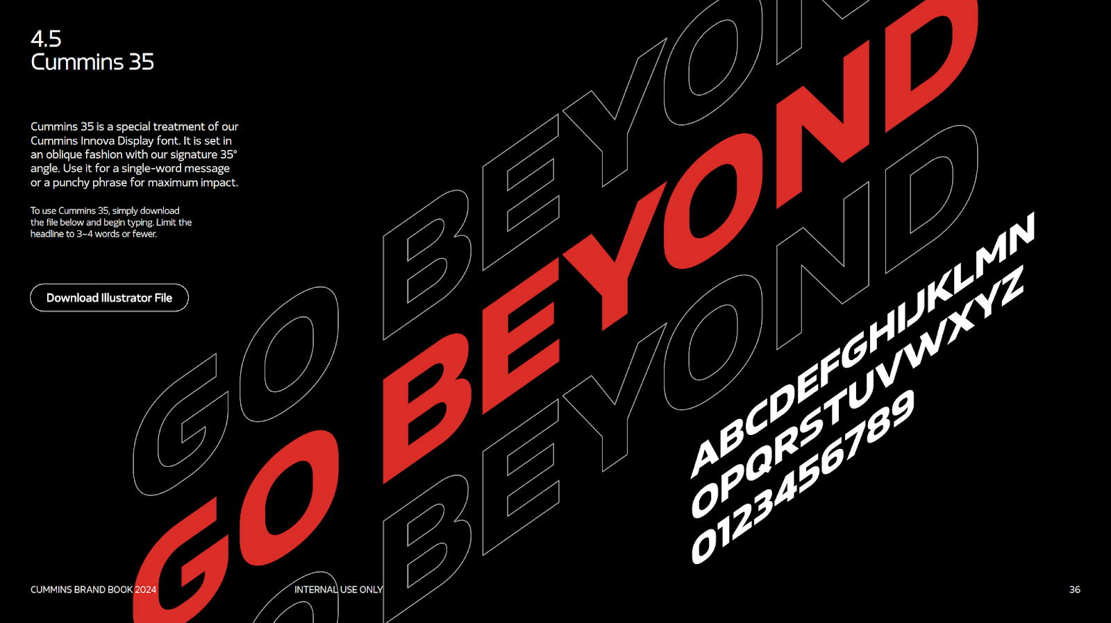
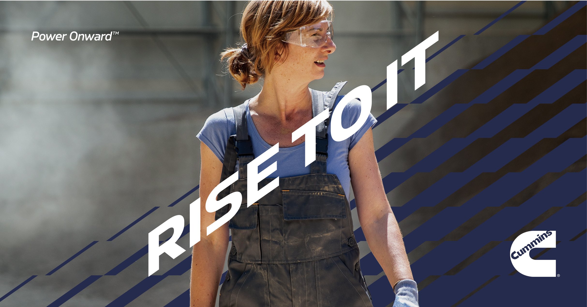
The 35° angle, drawn directly from the Cummins “C,” becomes the foundation of the new design system — a precise, intentional lean that signals progress. This signature angle carries the brand’s legacy forward, injecting momentum and modernity into every composition.
As a flexible structural device, the 35° angle adapts seamlessly across applications. It frames content, shapes layouts, and creates visual consistency while allowing for endless expression. A simple geometric gesture that keeps the brand grounded in its heritage, yet unmistakably leaning into the future.